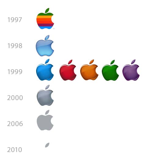
Cupertino, CA — Brace yourself. Apple is about to change its logo — again. The new corporate mark, set to roll out this summer, will be the tenth official logo for Apple in the last 13 years.
“Jony knocked this one out of the park,” said one executive, on condition of anonymity. “You can barely notice the damn thing anymore.”
Jony Ive, apparently searching for things to do now that iPad and iPhone 4 have launched, presented his new design at Apple’s quarterly Minimization Meeting last week.
In the meeting, Jony presented a minimal one-paragraph argument for making the change. “In the mobile age, we need to shed, not add. We’ve shed 24% of the iPhone’s bulk, we’ve shed Flash, and we will now shed the bulk of our logo. The leaf says all we need to say.”
“The old logo was way too complicated,” explains a graphic artist inside Apple. “Leaf, apple … apple, leaf — the eye never knew where to focus. The solution is pure Apple. Or, I should say, pure leaf.”
A new theme line, a minimized version of the old Think different line — Think dif™ — will accompany the new logo at launch. A pure brand campaign featuring the new logo is slated to run in prime outdoor media.
If all goes well, it will have minimal impact on Apple’s business.






Pingback: 苹果将迎来没有的苹果的新Logo? | 设计网
Pingback: Voor de Mac-liefhebbers (& haters): Scoopertino « Rcachterklap
Pingback: 35 Mouth Watering Photo Illustrations | Keep the Minutes 时光捕手
Pingback: I Am Christian Cardona Suárez
Pingback: 苹果将迎来没有的苹果的新Logo? – 设计电台
Pingback: 苹果将迎来没有的苹果的新Logo? | 标志说